Ghost, Animated Music Video
My Oldest Friend and Lotus Mountain Creative present: Ghost. An audio-visual feast. Would love to hear feedback on how you feel it turned out! For this post I wanted to look back on the process, share what went into it, and do a post mortem on what went right, what went wrong, and lessons learned!
Jacob and I started discussing the project back in Feb of 2018. He gave me this brief description for the tone he wanted:
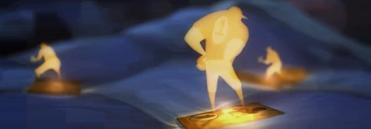
Early in the animation process I envisioned anime-style limited animation (6-8 frames per second), but the budget wouldn’t allow for the hyper inflated clean up required. This one scene ended up taking almost 1/5 of the overall budget!
Production finally wrapped in Feb of 2020. Unfortunately almost a exactly a year later than my original estimate/delivery goal. The video was met with a moderate amount of interest, being featured in a handful of Canadian music online publications and receiving a minimal amount of attention from un-promoted social media posts. Many film festivals were canceled, and the rest were relegated to online ‘events’ because of the Covid-19 pandemic. Not knowing how much attention a film would get under these conditions we chose not to enter it into film festivals. Unfortunately this made the debut of the video feel underwhelming and it’s impact, if any, quickly faded.
Looking back at the final product after more than a year out of the trenches I have a few final thoughts and changes I’d make. Creating smooth frame by frame animation takes skilled and patient craft work that unfortunately was too much for me to lend to the project out of pocket. The boards told a complete story that was hard for me to want to deviate from. The result was that many scenes in the second half of the video have almost no animation, and many character poses and final art is sub par. There are some early scenes that are almost to the quality I aspired to make the whole video. If I were to do the project over again with the same budget I would make these two dramatic changes.
- Focus on a small number of key animations and really polish them. High frame rate (12 fps), tight line-work. Then re-edit the film to fill run time with large chunks with beautiful but easy to generate loops and ambient shots. Slow pans of environment, hypnotic animations like butterfly’s and walking, etc.
- Edit the film to hit the beats of the song. Originally I had wanted to create a short film with Ghost as the soundtrack. I made a conscious choice that the editing wouldn’t ‘dance’ with the music beyond one notable exception, when the woman’s foot falls in a dramatic emotional shift in the song. I believe if the budget had allowed for fully animating and polishing the entire film, this choice would have been preferred, and have highlighted that the music was ideal to use as a film soundtrack. But audio and visuals ‘dancing’ together looks and feels good, and is a quick and easy way to enhance the experience.
I am considering doing a cut of the film edited to the beats of the song, and will post and share if and when! Thanks for going on this journey with me. -Peter
Music Video Trailer Released!
I was deep into storyboarding for this project this time last year, and am finally seeing the light at the end of the tunnel. Just got this trailer cut together by my friend Chris Finch and am excited to share it!
Space Sharks
Working within a very fun theme for this latest video: Space Road-trip! Here are some highlights from the video. I was responsible for storyboards, color, illustrations/designs, animation, and placing in sound and music.
Music Video Progress!
This is so rewarding and a great project to learn and grow from. This sequence is the product of about 2 months of work, including storyboards, animatic, color boards, animation, compositing. It is a short clip from the film (also has the most going on during this sequence too). Here are some of the steps along the way that it took to get here!
Woo! These storyboards were some of my favorite to create. I had discussed ideas and had a good amount of time to cultivate elements of what I wanted this video to look like. Then during an event called “Inktober” I blasted through on a wave of inspiration to storyboard the entire video with only 1 frame being scrapped from the project. 50 storyboards for a 4 minute animation.
Here is a quick look at some of the progress from there.
First, experimenting with a few scenes to find the final cleanup style
This was a lot of work in itself! Some things I discovered: Backgrounds were going to be more important than I first assumed. Even though he is walking through a big empty mostly black space, there needs to be something in the background to give depth and grounding. So I have a few backgrounds now to work with, especially when he gets close to the glowing pod. And there will be lots of particles and smoke vfx.
Next, I moved on to completing a whole sequence. Here you can see the animatic. Followed by some individual frame renders and a background (foreground?) for an upcoming scene. Findings here: The budget for this project is very small, so I am looking to cut time and effort without cutting quality as much as possible. One thing I found was that having the animation remain on a low frame rate looked great with the final compositing and camera movement. I am going to be able to use most of the animation from the animatic as rough animation and clean up straight from there. Time saver!
Once again, here is the sequence in progress, rendered from After Effects:
Science!
Here is a highlight reel from some earth science videos I helped produce for Western Governors University. A few illustrations were used from Getty Images (lemonade stand, soccer ball, bowling ball, background for the penguin flying), but almost all of it is designed, illustrated, and animated by myself. Voice of the science guy character is me, too.
Music Video, Color Script Progress
Production is moving along. Here I am exploring mood and color script. Moving on to making a vertical slice of one or more of these scenes.
Animated music video in production
I am incredibly honored to be working with a Canadian musician for a really cool project. We wanted to create a music video that fed our mutual love of Silent Hill and other creepy but beautiful fictional worlds. These storyboards came out as an organic stream of consciousness after extensive brainstorming sessions. The story is deeply meaningful to me, and I hope you enjoy as I share the creation process along the way!
Animation for Accounting
Jumping right into video production for Western Governors University! First big project was 7 videos for an Accounting course.
First goal of producing a video? Clarity! This is communication after all, communicating ideas and concepts too students.
Second goal? Engagement. Motivated students will pull information from any source they can get, but why not make it easy and enjoyable for all students to get this info? It’s like a treat for the mind!
Here are some of the highlights from the videos. I had great help learning the ropes with audio recording, and snagged a few great props from Getty Images. All other characters, props, and backgrounds were created for this project.
Summoners Fate
I’ve been involved with this incredible project, mostly animating, sometimes art directing, and I’m stoked to share its progress with you! I animated all characters and creatures, and helped lead the art direction for the overseas art team. Enjoy!
http://www.summonersfate.com/
https://www.facebook.com/D20Studios/
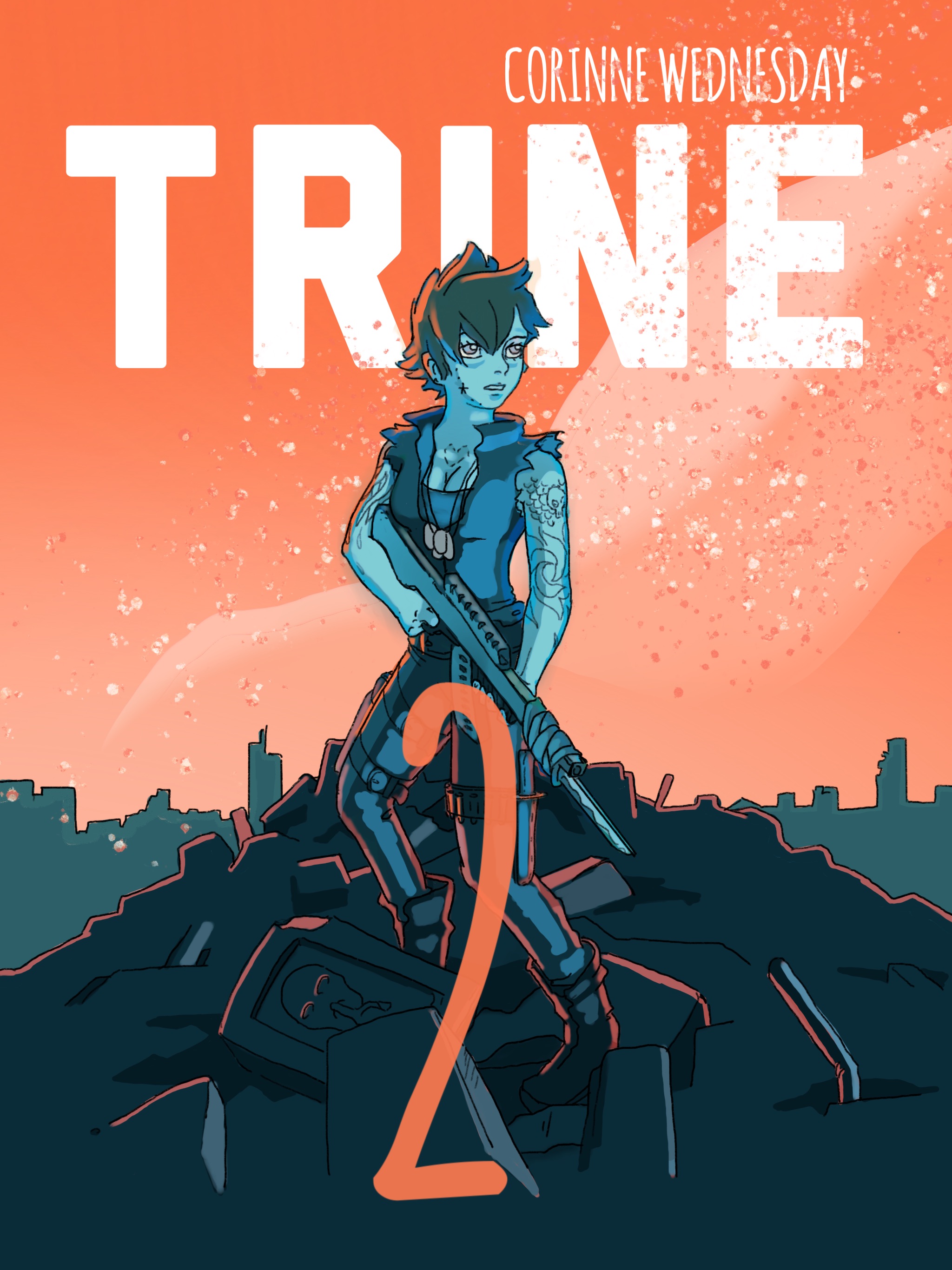
Book Cover For Trine 2
My brother is writing an epic sci-fi pulp novel, Trine 2. So for his birthday I gave him a book cover.
Started with defining the character. Zelle is a daughter of war.

Moved on to the composition and line drawing.

Wanted to add in a space battle, but it wasn’t working with this composition, and (although this is pretty cool looking) it made the text less readible.

So it’ll make it on the back cover eventually.

And here is the cover so far! I’m excited to read it 🤗

 Read more...
0 comments
demo reel 2018
Riddick Obsession Continues...
Painted in Procreate
Studying some beautiful films and compositions. I love having a reason to rewatch all the Riddick movies.
Vin Diesel fun
I suddenly want to watch all the Riddick movies over again, drawing the Vin Diesel character was so much fun. These are playing off someone else’s character designs, trying to recreate one of their characters, and then make a new(ish) one to add in.


Credit Character Design: Rick Ruiz-Dana
Red Panda 2D Animation
I did the character design and animation for this short piece in an environment in Animal Jam.
Put the pose into your body
This is not where I expected to be, even a year ago. I’d done yoga, actually a ton since becoming a stay at home father, but had never imagined it would lead here. A teacher training was advertised in my gym, and I signed up. Not knowing where it would lead, but excited for a new avenue of growth. As I learned more of the history of yoga, the connection of our body, mind, and …something more, I started a series of drawings. 


Prints available: https://www.etsy.com/shop/GuruArtist
Maze Party!
I have a fun mobile project on my back burner that I’ve been building in Unity. Pixel art is so fun!


![]()

![]()
![]()
![]()
![]()


Honor Park, non-violence Animation
Honor Park has an epic musical in the works for its non-violence episode. As part of the storytelling, I developed a short animated sequence to go along with the beautiful song Andrew Young wrote. This is the rough concept I used to pitch my idea to Andrew.
After Andrew approved the rough concept I developed the color script for the sequence.


Because the sequence was meant to look like ancestral historical story telling, the design of the characters was geometric and flat. I translated the rough concept into a defined animatic and continued on to animate and color the sequence.
This episode is still in development, but I will update here when final compositing and sound are added! It has been an inspiring project to work on. Andrew Young is a complete powerhouse of talent!
Rough Honor Park Animations
In Honor Park, young boys are inspired to become great men. The host, creator, and mastermind, Andrew Young, takes viewers on high octane adventures and always comes back to home base, Honor Park. Some stories are told through Andrew’s interactions with his lively chalkboard.
Global Game Jam 2016


I think I’m finally done detoxing from a weekend filled with Monsters, Mountain Dew, junk food, and sleepless nights. Let’s hear it for Global Game Jam 2016!
I’m really proud of what our game team was able to create in the 48 hours allowed. The design of this character, bathroom door, and color scheme were done by Jackson LeTourneau. I made the animation and ‘effects’
Fox Animated Postcard
Spider Pet Animations - 2D
Raccoon Pet Animations
Arctic Wolf Pup 2D Animation
Hummingbird Pet 2D Animations
Fire Spell Effect Animation
Posted in: 2D AnimationEFXPortfolio Read more... 0 commentsDreamgiver - 2D Animation and Cleanup
 Read more...
0 comments
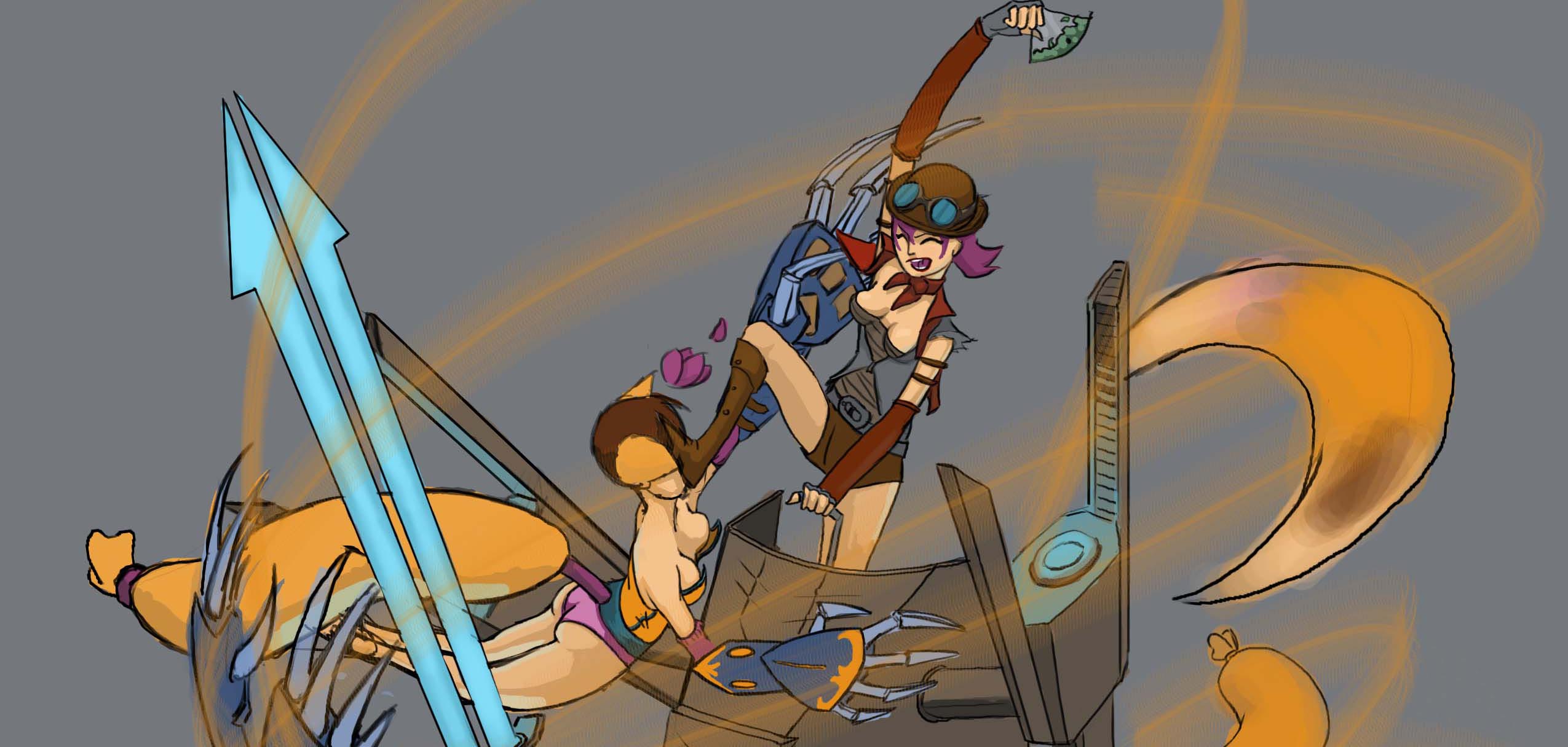
Fan Art #JouleVainglory

Postcard Illustrations
Here are a couple of postcards I’ve made for the online game Animal Jam® – Wild Works, Inc.


Fan Art #Vainglory

 Read more...
0 comments
DreamGiver 2D Sequence: Animatic
This is the Animatic for the 2D sequence in the short student film DreamGiver, directed by Tyler Carter. A Brigham Young University Center for Animation Production.
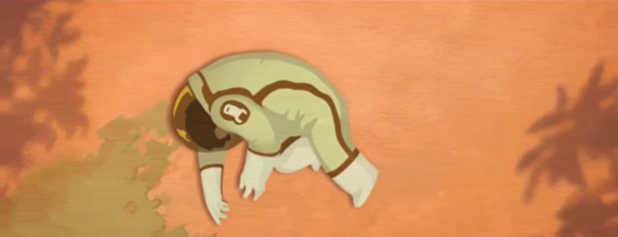
I worked closely with Tyler Carter to help create the second main 2D sequence in DreamGiver. I think this may be version…90? 93? We had a lot of fun trying to figure out how the monster was going to die, and how the Dreamgiver would help the boy.
I used Adobe Flash to make this.
This also features the work of Aaron Ludwig. We worked together to create 3 or 4 completely different versions of this. His monster head, and monster foot are the remnants of his excellent work. Aaron also did the animation for the boy at the end of the animatic!
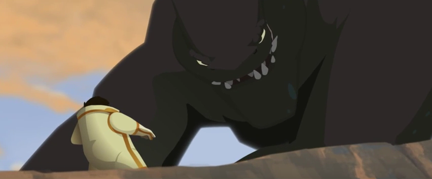
This is the second main 2D sequence in the short student film, DreamGiver, from Brigham Young University. Directed by Tyler Carter.
I helped make the storyboards/animatic for this section. I also made the final monster design, and animated the monster and the Dreamgiver.
These other fine artists are the other creators behind this: Aaron Ludwig, Tyler Carter, Jason Keyser, Michael Murdock, Sidney Strigham, Paige Strigham, Markham Carrol, Laura Allred, Younhee Burningham, Paul Petty, and Anthony Holden.
 Read more...
0 comments
Baseball 2D Animation - Dream Giver
 Read more...
0 comments


